It’s no mystery that to be successful in business, one must evolve and adapt to the ever-changing consumer demand. Sometimes it’s not necessarily a change in consumer taste, but also recognizing that the things you are currently doing could be done a little better, thus making for happier customers. Stagnant companies become obsolete and ultimately fade away.
Really listening to your customers and evaluating their feedback is critical to ensuring you are offering the right products in the right way.
Over the last 3 years, we’ve completed dozens of large projects across the country. Many of them have gone smoothly, but a few had some bumps in the road, which can be expected with a growing company. The biggest mistake for us on these handful of challenging ones would have been to fight through the challenges and then to ignore them and move on to the next project. However, we have taken away something valuable from every project to ensure that any problems which may have arisen are not repeated on future projects.
As we reflect on ways in which our obstacle designs have changed, below are some updated features we thought were worth highlighting.
- Mounting of Various obstacles – It may sound simple, but we’ve made quite a few changes to how our obstacles are hung. Two things gym owners want to see with hanging things are flexibility and ease. Obstacles that are mounted should have the ability to be adjusted in some manner, and they should be fairly simple to install.

The Flying Rings – original hanging design versus new hanging design
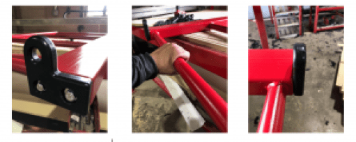
The flying Rings are a great obstacle, but the original design had a few limiting features. The most significant limiting feature was the fact that we started off welding the drop down sticks to the crossbar. Functionally, they were fine, but it meant these crossbars were not usable for any other obstacle. This wasn’t good for our customers. So, we changed the hooks to a bolt-on design and gave them a cool look as seen in the above photo.
- Aesthetics – We are big on looks! When we sell a product to a customer, not only is it going to function well and last long, but it is going to look great. We put a lot of effort into creating a “look” to our Ninja line. We want people to walk into a gym and say “Ah, that’s ag Ninja’s stuff.” The Flying Rings pictured above were part of the group of obstacles that we felt needed that extra flare. Additionally, the flying bar trainer is another great example of an obstacle that had a drastic face lift as well as some beneficial material changes.

The Flying Bar Trainer – original design versus new design
The original design of the Flying Bar Trainer consisted of wood and steel mounting pieces. In addition, it was one of those obstacles that had the mounting bracket which prevented variation in the width of the obstacle. In the new design, there is more attention to the aesthetics while also allowing for variation in width.
Below are a few other examples of some obstacles in which we added some of our own touches that are more visually appealing…

- Functionality – A lot of work goes into the design of a product to ensure that it functions the way we intended. After we design, we manufacture, and then we test it to ensure it is safe. Even then, you really don’t get good quality feedback until it is out there being used on a regular basis. Often times, the product gets into the hands of the customer, and everything is perfect. Sometimes, however, there are minor flaws a customer will point out that they may be able to live with but want you to be aware of for future customers. This feedback is invaluable, and we absolutely welcome it. A few examples of products that have had some design tweaking along the way to allow for better functionality include a few of our obstacles hung by a swing and our slanted steps.
Obstacles hung by a sling – We have a number of obstacles which freely hang by way of a sling. Determining the best way for a sling to attach to an obstacle has changed a few times. After evaluating feedback and testing various methods, we nailed down a good looking solution.


Slanted Steps – Slanted Steps are a must in a ninja facility, so it’s pretty important that they function well. Version 1 of the steps looked great, but they had a few characteristics which may not be desirable in all training situations. So, we went back to the drawing board to develop a step that was versatile and allowed for ninjas of all ages and sizes to use them.

Obstacle Training, in my opinion, will continue to grow and will be around for a long, long time. Methods will change, regulations may change, and customer taste is always a moving target. It’s a mighty fun ride for us, and we know the importance of continuing to evolve so that we aren’t left watching the train leave while we are sitting at the station.
Brad Thornton
Chief Operations Officer/Designer/Co-Owner
Brad@InteractiveSportsZone.com
